UX Design Services
SoftTeco specializes in creating a user-centered UX design to draw users at every stage of a meaningful customer journey.
SoftTeco’s UX services
With over 18 years of experience, SoftTeco offers a wide range of UX Design Services tailored to each client’s individual needs. Our dedicated UX professionals constantly keep an eye on the most in-demand UX trends and put users at the center of processes to create memorable experiences. Get a tailored solution that your users will love with SoftTeco’s UX design experts.
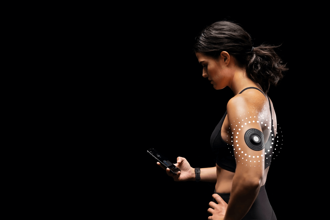
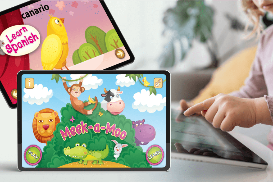
Industries that we work with
SoftTeco’s UX design process
We aim to create an appropriate design step-by-step to ensure client satisfaction and to match your brand style. Here is our UX design workflow:
Requirements collection
Our team determines the project’s goal with stakeholders based on their business, design, and technical requirements
Research
We conduct extensive research to achieve the best analytics outcomes: user research, market research, competitive research, and product research
Detailed analysis
We collect, analyze, and determine potential user behavior patterns. Our in-depth analysis of the UX process includes creating user personas, user stories, and storyboards
Information architecture
Our UX team provides Information Architecture (IA) to create website maps and structure content elements. Thus, you get smooth navigation through a product and enhance user experience
Sketching & wireframing
SoftTeco’s UX designers create sketches and wireframes to visualize the basic structure of a product page: the main elements and how they fit together. Our UX experts use them to build mockups and prototypes to present a final product to clients
Prototyping
Our UX design team converts wireframes and mockups into low-fidelity and high-fidelity prototypes that allow stakeholders to visualize how a final product will look and function
Usability testing
During usability testing, our UX professionals determine a system’s existing and potential usability issues and obtain qualitative and quantitative data on the user experience. Designer teams test ideas internally and share prototypes with stakeholders for feedback
Enjoy bringing your idea to life with our professional UX design team, motivated to do exceptional user experience for your business.
What makes SoftTeco’s user experience design services stand out?
18+ years of experience in UX design
2X less time spent on UI design development
Use UX design metrics to measure design success
Work with diverse brands across different industries
Unlimited revisions and a full-fledged market launch